Will to Win

Six adventurers have taken a risk and have traveled amidst the human village. They are searching for the three symbols, stolen by humans, and have trekked through the Adirondack Mountains in order to retrieve their precious artifacts. Their leader, the white rabbit sitting atop the Morgan horse, has gathered these creatures into one union. They are the rabbits of the Valley of Peace, and together with their canine and equestrian friends, they embark on a momentous journey, driven by will to accomplish their task and urged by the sensation that they will win their accomplishment and bring glory to their nation.

Will to Win

Posted in Uncategorized | Leave a comment

Hannah Gullickson of Literature & Writing

This post signifies the completion of this course. The purpose of this assignment was to create a template based on an existing magazine page and insert new material based entirely on the author. I have inserted material based on my education, accomplishments, and future goals and have thus distinguished myself as a student of the Literature and Writing Department of Northwestern College.

Hannah Gullickson

Posted in Uncategorized | Leave a comment

Progress on The Second Thing I Remember

This post shows the progress for my re-designed adaptation of Judith Hougen’s The Second Thing I Remember. This project will consist of four books. Inserted into this post are the four cover title pages, the four subtitle pages, and a few sample spreads from each section.

Four Title Pages:

Title Page 1   Title Page 2  Title Page 3  Title Page 4

Four Subtitle Pages:

Subtitle Page 1  Subtitle Page 2  Subtitle Page 3  Subtitle Page 4

Sample Spread for Part 1:

Spread 1  Spread 2  Spread 3  Spread 4

My hope is that the margins between the text boxes and the title text boxes will be consistent (such as the 3/4″ for many of the simple poems), though I realize that I had to adjust some margins according to the quotes or dedications (eg. “for John”) inserted underneath the title text boxes.

My four books will have 8.5 x 11 white, gloss pages with a black hardback cover. I will order my books at the print shop of Thompson Reuters and will receive the finished copies within three or four days.

Posted in Uncategorized | Leave a comment

The Second Thing I Remember: A Collection of Poems by Judith Hougen

The following title page and page spreads are the first draft of a three-book series. The material will be reprinted from Judith Hougen’s The Second Thing I Remember, a collection of contemporary poems. Her book is divided into four parts, the first of which is entitled “Between Earth and the Closest Stars.”

Title Page

Between Earth and the Closest Stars

Posted in Uncategorized | Leave a comment

Layout Explication

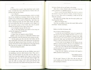
This post is dedicated to the explication of a layout example, focusing on McSweeney’s 15, a collection of contemporary adult short stories.

This excerpt is derived from McSweeney's "Fridrik and the Eeejit," by Sjon, pages 152 and 153.

I chose this example because I enjoyed the border and the typography. Thin black lines separate the chapter title in one long box above the text and allocate each page number in its own box at the bottom of the page. While the chapter title’s box extends from the left border to the right (the entire width of the page), the page number’s box almost wraps around the page numbers in a half-inch frame.

Likewise, the margins from the border to the edge of the physical page (on the bottom and sides) are half an inch. The height of the chapter title box is one fourth of an inch, and the remaining fourth-inch is seen from the top border to the top physical edge of the page. The margins from the justified text to the borders are three eighths of an inch. (An additional one-fourth inch is required to separate the letter, whose author is emphasized in italics.) The typeface most closely resembles the GoudyOldStyle in approximately 10pt font size with 14pt leading. (Whatever the specific typeface is is uncertain; yet I enjoy the soft curves of the capital serifs, most notably with the S‘s and C‘s.)

These elements add to the clarity of the typography. The overall spacing allows for room in which the reader does not need to squint or focus too intensely. Rather, these elements have created an easy layout for an enjoyable recreation.

Posted in Uncategorized | Leave a comment

Baskerville Books

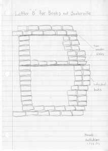
This sculpture was inspired by the Baskerville typeface and created by Hannah Gullickson for Intro to Layout, Spring 2012.

I started with a basic sketch of my idea. I’d planned to stack the books in roughly two towers, while gradually curving the books to the right and supporting them with two wooden slabs.

My next step was creating the base of the B. I had several people, including the librarian of the Bernsten Library, help me create the base by positioning two rows of books. We gradually added the two sides of the B and curved the bottom layer by sliding the thick books to the right and supporting them with small books. We added a wooden slab and placed one row of books on top of it.  We added the remaining curve for the top, again sliding the thick books to the left and supporting them with the small books, and completed the B with a small hill of books on top of the last wooden slab.

Bernsten’s Baskerville Books


Posted in Uncategorized | Leave a comment

Inspiration


Posted in Uncategorized | Leave a comment

The Elegance and History of Four Selected Typefaces

The following illustrations are sample typefaces from the Intro to Layout class of Spring 2012. The first illustration is a collection of four typefaces which will further be magnified by the subsequent letters.

This collection includes the four typefaces of Baskerville, Didot, Extra Condensed (“Rude”), and Italian Hand (“Bon”). In the following examples, I will explain the history of each typeface.
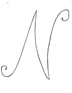
The first typeface is the Italian Hand, created by Englishman George Bickham of 1743. His calligraphic style indicates a break from what author Ellen Lupton defines as the “rigid nib of humanism.” During the Renaissance, typefaces such as Jenson (named after Nicolas Jenson of 1465 France) had already evolved from the intimidating styles of gothic letterforms, such as the Black Letter of Johannes Gutenburg. Bickham’s typeface further evolves the history of typefaces in that it returns to the calligraphy of the pen.
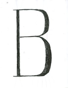
The Baskerville typeface, designed by John Baskerville of England in 1757. John, like Bickham, desired to return to calligraphy in his printing. His letterforms include the graceful flow of lettering that most aptly portrays the calligraphic style he accomplished. However, his typeface was severely criticized and claimed to be “too thin and narrow [for] the Eye.” Nevertheless, his typeface pioneered the next movement in printing history: the emergence of the “monster fonts.”

The Extra Condensed typeface was among the many creations of Giambittista Bondoni of Italy and Frimin Didot of France. In the early nineteenth century, they inflated their letterforms to strike attention from their readers, most notably through the use of advertisements. These fonts helped create the era of the Industrialization that would infiltrate the cities like “locust swarms of print,” in the words of Walter Benjamin.
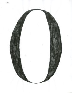
The last and remaining typeface is the HTF Didot, designed by Jonathan Hoefler of America in 1992. He was inspired by the creation of Francois Ambroise Didot, who designed his typeface in 1784. This typeface marks the return of classical art into our modern society. Though our history of typefaces will always evolve into creations more revolutionary than the next, classical typefaces will inevitably resurface.

Posted in Uncategorized | Leave a comment

Anything Is Possible

Introduction to Hannah Gullickson's Suite, Spring 2012


Posted in Uncategorized | Tagged , | Leave a comment

Nature’s Tranquillity

As I walked about the island, I noticed a peculiar sight. It was a bridge, and beyond it lay a little church hidden by bare trees. I followed the bridge that led to the church, and lo! the church was abandoned. Its moldy roof crumbled under the weight of snow and age. Decades of abandonment had destroyed the building. Only the stained glass windows and the carved door remained as the hope of survival. I gazed upon this structure and thanked my Lord for its fortitude.

Beside this lake I sat all alone, beholding this great beauty. I heard the water’s gentle lapping against the shore and the haunting laugh of a loon. My hair brushed against my cheeks as the wind tossed it about. My fears were at peace. At this lake was calm.

The brush covered the shore as a jacket would a person. Beyond glittering waters lay golden trees bathed in autumn light. The air nipped the trees’ leaves, tossing many down and leaving the strongest at their branches, while the sun played with the colors and painted each one a different shade of yellow, gold, or mahogany. The houses lay in stillness, while inside their walls the wives busily cooked apple pies and homemade cider.

At last, my home for the season. The road beside Riley Hall lay with cars rivaling for spots, while the maples and willows lay adorned in autumn splendor. The sun smiled and laughed as its beams tinted the shade of the leaves. The maples shivered in the descending temperatures. The willows comforted their neighbors; yet no sooner had the temperatures reached 32 degrees did they, too, lose hope of survival. Autumn has approached, and its foreboding nature was nigh.

Posted in Uncategorized | Tagged , , , , , , , , | Leave a comment